
Making a More Accessible Web: The Building Blocks of Accessibility
The World Health Organization (WHO) estimates that more than one billion people (roughly 15 percent of the global population) live with some form of disability. By law, content and design elements should follow accessibility principles that allow everyone to reach your products and services.
In this article, we’ll take a closer look at ways in which businesses can make more accessible websites–whether it’s through the lens of design or content marketing.
What Is Web Accessibility?
Web accessibility focuses on creating websites, tools, and technological resources that accommodate people with disabilities. This means that sites designed with basic accessibility guidelines in mind can make more content types available to more users. Web accessibility aims to be inclusive of all disabilities that affect direct access to a site and its pages, including:
- Vision.
- Speech.
- Physical conditions.
- Neurological conditions.
- Intellectual and cognitive disabilities.
- Auditory or other forms of auditory processing disorders (APD).
With a few adjustments, people with these impairments can browse your site more easily. An accessible content strategy considers all components of the user experience, from enabling resizable text options to structuring page headings by order of importance. Here are six useful tips to help you create accessible web content for your next project.
1. Enable Simple Navigation Options
It’s important for any website visitor to be able to seamlessly move through their content, assisted by screen readers or otherwise. And for those with motor disabilities, you should consider inclusive navigation options that enable exploration. This works to help people understand where they are on your site and makes it easier to continue navigating. For instance, the tab key allows visitors to move through links, and all keyboards and screen readers will register them as they are. That said, the tab order should follow the site’s visual flow: either left to right or top to bottom — featuring a header, main navigation, content, and footer.
2. Consider Foreground and Background Color Contrasts
The concept of color contrast is an essential aspect of accessibility for designers and web developers. According to the Bureau of Internet Accessibility, color contrast refers to the difference in luminance or light between a font style and its background. Implementing opposing segments of the color wheel will create font and background visibility that can be interpreted by all users.
It’s easy to improve your site’s color contrast. One of the simplest ways is by testing your contrast ratios. Each guideline of Web Content Accessibility Guideline 2.2 has three conformance levels: A (beginner), AA (intermediate) and AAA (advanced). However, AA is considered the industry standard for most websites. The intermediate level for color contrast is a 4:5:1 ratio between the foreground and background. You can also change the color lightness of your foreground or background elements, including text on images, design gradients, navigation, and CTA buttons. We’ve included a list of tools to help check and select appropriate color combinations below:
3. Publish Transcripts for Audio or Video Assets
Accessible audio-visual assets make it possible for deaf or blind users to interact with your content. Plus, from a performance perspective, publishing text transcripts will make it easier for Google to understand the context of your page, help your site rank higher in the search engine results pages, and provide a useful resource for people who cannot listen to audio.
Also, captions also play an important role in today’s accessibility standards. Many pre-recorded YouTube or podcast shows include options that enable you to auto-sync text within your videos.
4. Avoid Hard-to-Read Typefaces
Because content stands as the foundation of a website, it’s critical to display text in an optimally-readable format. Yes, screen readers assist with explaining text for visually impaired people, but choosing easy-to-read typefaces will benefit more visitors from the outset especially if your brand is not attached to a particular typeface.
Use this table to learn more about font styles and best practices when publishing content to your site.
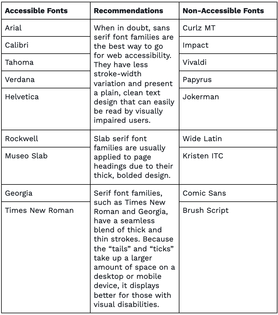
Selecting the best font style for your site is only one of many considerations for web accessibility. To learn more about legible font styles and sizing requirements, visit (WCAG) 2.1.
5. Write Alternative Text For All Non-text Content
For those who are visually impaired, alt text is useful for describing visual content. Alternative text, commonly known as alt text, is written copy that describes an image that fails to load. It is also what screen readers see when reading an image for people. Knowing what makes a good alt text description is important to people with cognitive impairments, motion sensitivity, or seizure disorders. This HTML code example from Moz illustrates an effective and descriptive alt text attribute of Doritos.
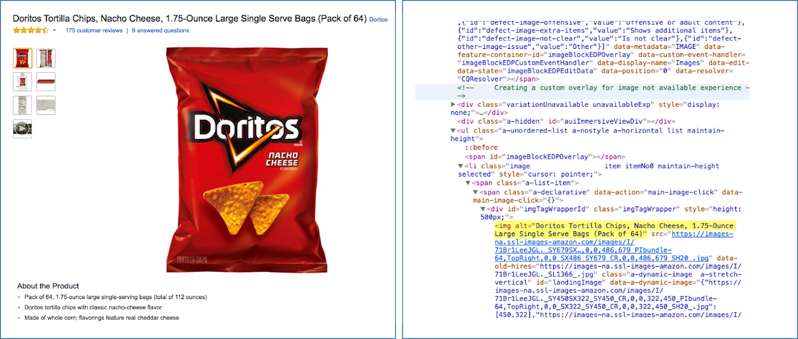
Instead of saying “chips,” the attribute details the flavor, brand and size.
When you write alt text, keep it brief and concise. Are there charts, graphs, or statistical data being shown? If so, make sure that key information is included in the alt text. Google is currently working on an automatic image captioning tool that uses AI technology to describe 94 percent of photos. Although this model is still in the research phase, there are other screen reading tools out on the market, such as Eye-Pal and VoiceOver.
6. Be Aware of Photosensitive Users
Website speed is a significant part of page design but making sure your site is safe for everyone to use should be a high priority. An often-overlooked accessibility feature is the rate at which photos flash on a website. Having graphics that flash more than three times per second could induce a seizure in viewers that are photosensitive. Avoiding overly flashy graphics can reduce this risk but there are tools such as UserWay that allow visitors to pause graphics or increase text size.
Contact IDX
The IDX Content and Creative team helps businesses unleash their brand stories with powerful content. Contact us to learn how we can help you.
Going Beyond The Basics
Check out the following resources to learn more about how to make your website accessible to all users:
Sources:
- https://www.who.int/en/news-room/fact-sheets/detail/disability-and-health
- https://www.w3.org/WAI/
- https://www.who.int/news-room/fact-sheets/detail/blindness-and-visual-impairment
- https://www.w3.org/TR/WCAG22/#use-of-color
- https://developers.google.com/web/fundamentals/accessibility
- https://www.w3.org/WAI/tips/designing/
- https://uxplanet.org/a-primer-to-web-accessibility-for-designers-2c548448c612