
5 Best Practices to Improve the UX of Your Website
Good User Experience (UX) can keep users on your website longer and make them more likely to do what you want them to. Do you have a product that you’re trying to sell or a form that you want users to fill out? Great! Let’s get them there in a fuss-free way so they don’t leave your site for a competitor.
In this article, we will walk through 5 fairly simple things that you can do to improve the UX of your site.
1. Contrast Ratio
A frequent headache for our clients is making their website meet sometimes nebulous accessibility standards. At Investis Digital, we rely on the Web Content Accessibility Guidelines (WCAG) set forth by the World Wide Web Consortium (W3C). Of the requirements outlined in WCAG, the main issue that we run across is items failing contrast ratio guidelines.
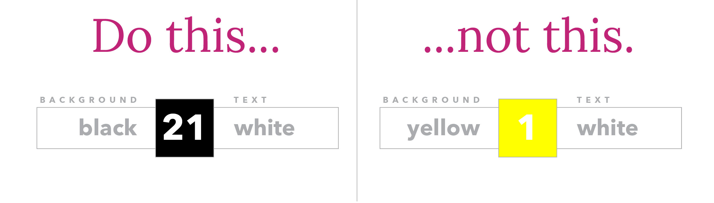
When an item has a low contrast ratio, it is difficult to pick it out from its background, whereas an object with a high contrast ratio stands out from its background. Contrast Ratios can vary from 1:1, or no contrast at all, to 21:1, which would be black on a white background or vice versa.
The best practice for contrast ratio is that all text, including images of text, has a contrast ratio of at least 4.5:1, with a couple of exceptions:
- Large Text (over 18pt or 14pt bold) should have a contrast ratio of at least 3:1.
- Incidental/decorative text or Logotypes (part of a logo or brand name) have no contrast ratio requirements
Contrast ratio can be checked with the helpful contrast-ratio.com.
When it comes to Conversion Rate Optimization contrast ratio is extremely important with links, forms, and Calls-to-Action (CTAs). We want these items to be legible and for them to stand out from the rest of the content.
2. Form labels
All fields should have a label associated with them that spells out what the field is for. This label should be placed above the field and left-aligned. Studies, as well as our own Conversion Rate Optimization tests, have shown forms with labels to the left and fields to the right are less efficient so this layout should be avoided.
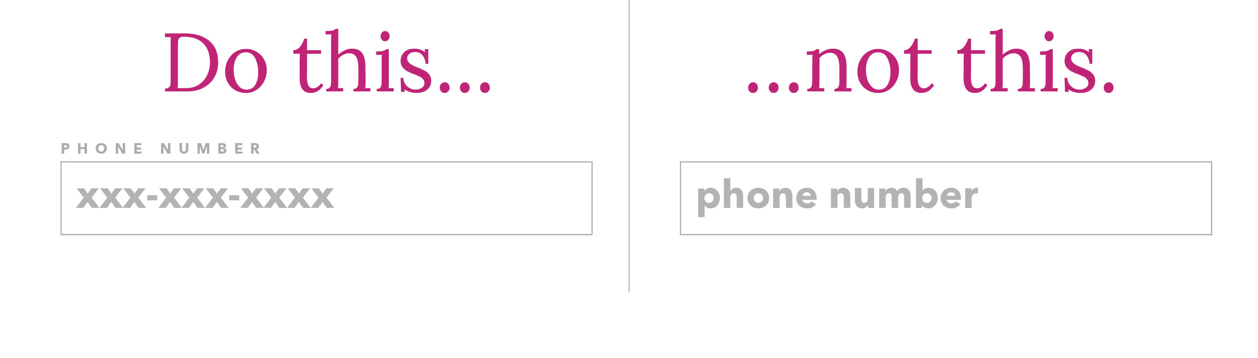
A “placeholder” element should not be mistaken as a suitable label. Placeholders are text that you see inside of a form field which disappears as soon as you start typing. For a field “Phone Number” the placeholder could be “xxx-xxx-xxxx” to show users that is your preferred format, but it should not be “phone number”.
The reasoning for not relying on placeholder text to describe a field is because this text disappears when a user enters the field. One example of this being poor user experience: If a user’s browser auto-fills their fields it would be impossible for them to verify the browser filled the fields correctly without deleting what is in the field.
3. Typographic Hierarchy
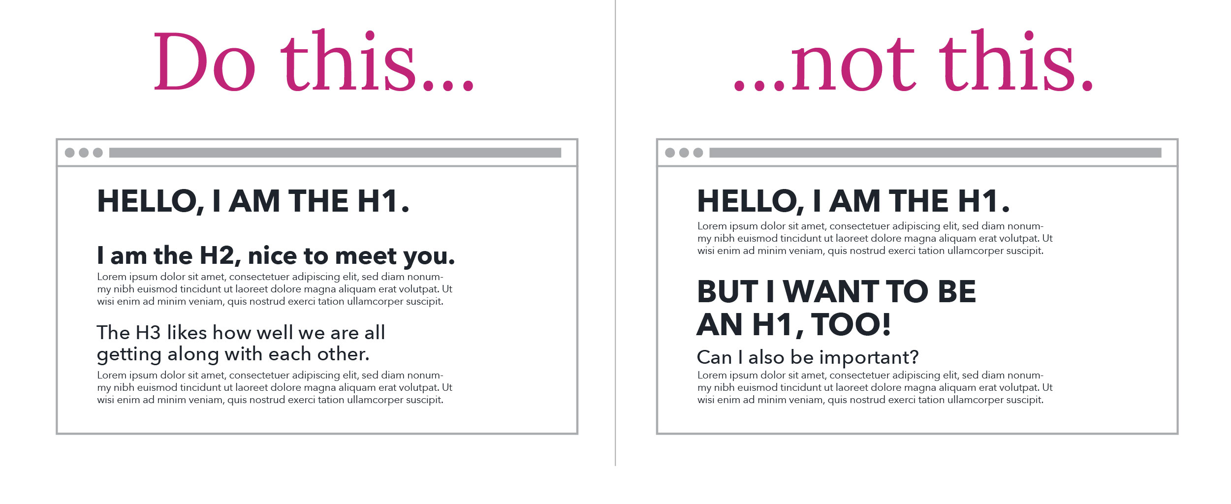
Typographic Hierarchy is built right into the HTML standard, so it would be madness to ignore it. Headings are given HTML tags that rank their importance, from <h1> through <h6>.
In general, you never want to have more than one H1 tag per page. This tag summarizes what the entire page is about. H2 tags then break the page into sections, with each of those sections able to be further broken down by H3 tags and so on.
Think of your website as a Newspaper. Each section of the Newspaper is a page on your site. The H1 is the name of that section of the newspaper. Each article has a title, those are your H2s. Each article usually has sections broken up by another heading, these are your H3s.
For most cases, you aren’t going to need to go beyond H3, though if you want to further break down that section you can move on to H4 and further.
4. Line-length
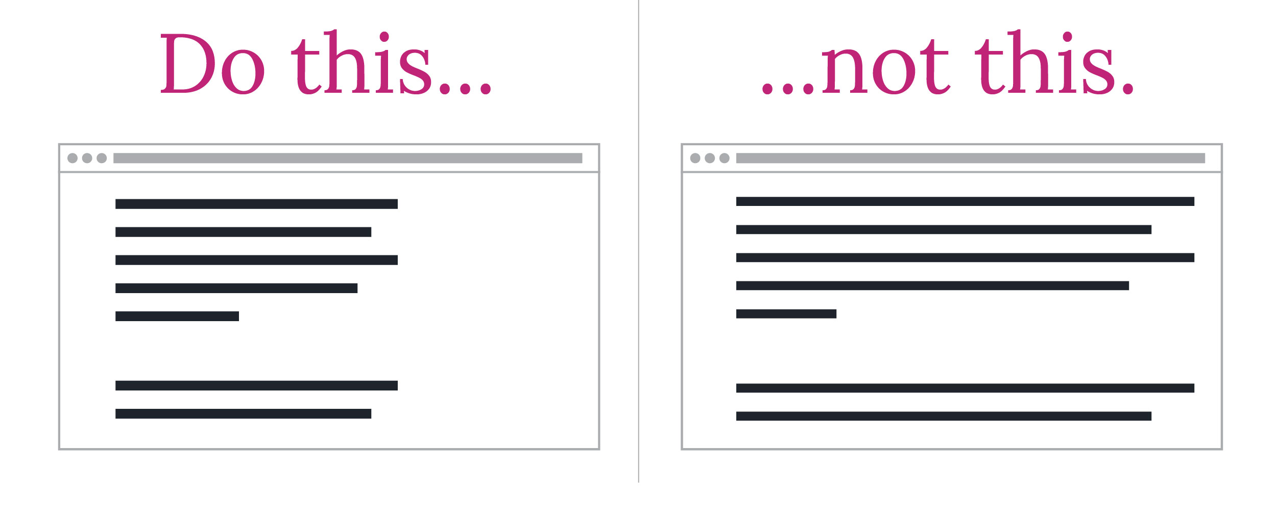
As screen sizes continue to become more and more unpredictable, it’s vital to ensure that website copy doesn’t exceed a legible line-length.
People don’t “read” websites, they visually scan them, picking out words and sections that seem interesting to them. The pattern that people use to scan websites is an F pattern, left to right, then back to the left, then down, and then the pattern starts over. If they get tired of the left to right they’ll follow the text along the left side looking for something interesting. Typographic hierarchy can help here to establish clear sections, as well as the occasional bulleted list to break up the F pattern.
This brings us to line length! If a line of text is too long it can be hard for users to scan back to the left and pick up the next line. This can cause users to re-read lines that they’ve already read, which, as you can probably guess, isn’t the best user experience.
This has been a topic of study in typography for at least 100 years and likely longer. If you’ve ever wondered why most books are a standardized width, now you know!
The generally agreed-upon standard is anywhere from 45-75 characters is the sweet spot for line-length. This includes spaces and punctuation.
5. Fitt’s Law
There are many Laws of UX and we recommend that you take some time to browse through them, but for now, we’re going to look at Fitt’s Law, which states:
“The time to acquire a target is a function of the distance to and size of the target.”
To put that another way, make objects that you want your user to interact with large enough for them to see, and put them near other things they are already using.
We can see this law in action all over the web. Here’s one example:
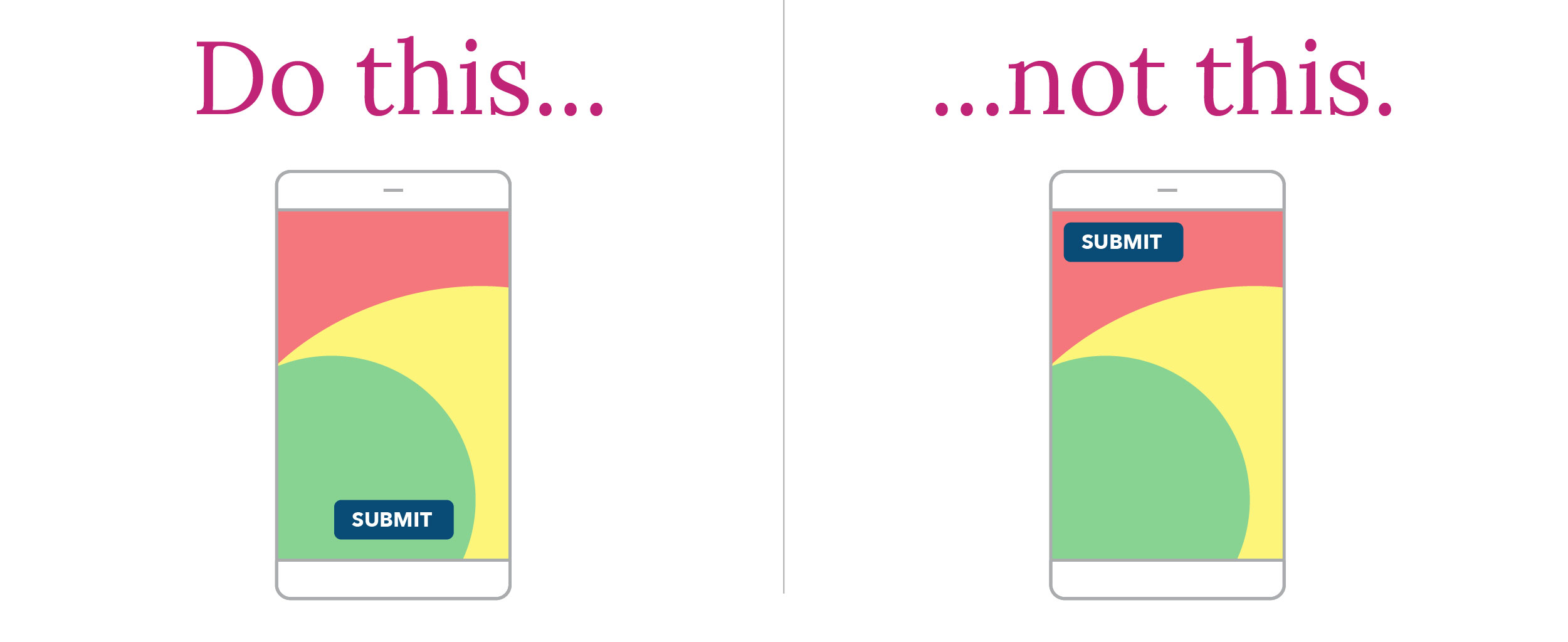
Let’s say you have a form with 3 fields, all stacked on top of each other. On desktops, the best practice would be to put the submit button at the bottom, left-aligned. This is because the user’s mouse would already be positioned near the left side of the fields in order to click into them.
On mobile, the best practice would be to either have the submit button full width or right-aligned since most users are right-handed and their thumb will be positioned right near the button.
Because of Fitt’s Law, there has been a shift in recent years towards putting menu and settings buttons towards the bottom of the screen on mobile sites and apps.
In conclusion
There are many other UX best practices that your website should follow, but these 5 will put you on the road to much happier site visitors, as well as increased conversions. If you’d like to learn more about UX best practices and conversion rate optimization then be sure to reach out to us!