
Why Data Visualization is Important for Digital Marketing
Data collection has become a popular endeavor for many companies in the past decade. With companies like Facebook, Google, and Amazon using data as the backbone to drive revenue, improve their services, and inform business decisions like billion-dollar acquisitions, it is no longer a secret that data collection is not only important but necessary for any business.
However, while many companies have recognized the importance of data collection and are collecting hundreds of thousands of data points in platforms like Google Analytics and HubSpot, the next big hurdle is visualizing that data into something that is easily understood and useful.
In the following article, we will explain why data visualization is important, how you can start using data to drive your business and digital marketing decisions, and how IDX utilizes data visualization to improve the performance of our client’s digital marketing.
What is Data Visualization
By its nature, data is unrefined, bulky, and rarely in a format to easily pull insights and identify opportunities. Data visualization is the process of taking that raw data and transforming it into something that is more easily understood.
Humans are not good at processing large amounts of raw data. If you looked at an Excel sheet with columns of metrics and dimensions and a thousand rows, would you be able to easily identify the trends? Probably not.
Now, take that Excel document and import it into a data visualization software, like Google Data Studio, and turn it into a graph. All of a sudden, a thousand rows get drilled down to a single graph that visualizes the raw data, which can help you identify the trends and insights.
And in the digital marketing space, as businesses collect more and more data from platforms like Facebook Ads, Google Analytics, HubSpot, Moz, SEMRush, and more, there is a need to visualize that data and turn it into actionable insights.
Just look at the graph of Google Trends data for the keywords “digital marketing” and “data visualization” and see how they have reported a steady increase in popularity since 2004.
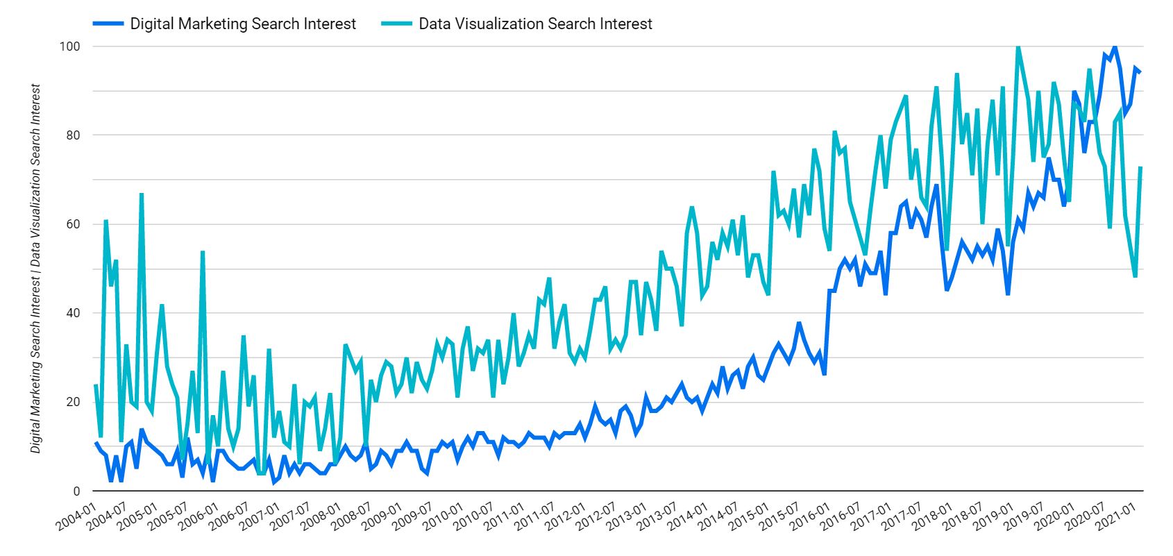 Now, this graph doesn’t mean that digital marketing was the sole factor in causing data visualization to increase in popularity, but the two are certainly correlated. And it makes sense.
As we collect more data through our digital marketing efforts, we need to visualize that data to better understand it. At its core, data visualization is making vast amounts of data easy to understand.
Why is Data Visualization Important
Data visualization is important in all industries that can benefit from data collection and analysis, but it is especially important in digital marketing to ensure your marketing dollars are being spent effectively.
Collecting data is only one part of the equation. If you’re not taking action on those data points, what good are they? It’s the equivalent of creating a strong digital strategy and throwing it on the shelf to collect dust.
Out of the box, digital marketing platforms like Google Analytics and HubSpot collect a mountain of valuable data. And if you tie in your CRM or add custom events using platforms like Google Tag Manager, the amount of data steadily increases.
Data visualization is important for a number of reasons, but most importantly it transforms all that raw data you’ve been collecting into something useful and actionable. After all, if you’re not using your data to improve your campaigns or identify opportunities, what good is it?
The best way to make your data actionable is to ask questions of it. And to get the answers quickly and effectively, you must visualize the answers to those questions.
When it comes to digital marketing, here are just a few of the questions you can answer:
- Is my website traffic trending up or down?
- What are my top landing pages by conversion rate?
- What directories on our site get the most traffic?
- Are users who utilize our interactive content more likely to convert?
- Are we ranking for more keywords than we were last year?
All of those questions can be answered by digging through your raw data in the respective platforms or Excel files, but it might take you some time to grab the answers, especially if you have to do that each month. And sometimes the data isn’t available in the standard platform metrics.
The better way to get the answers to those questions is through visualization. And the best part is that you only need to do it once and you can go back to your reporting dashboard to review performance each month.
How is Data Structured for Visualization
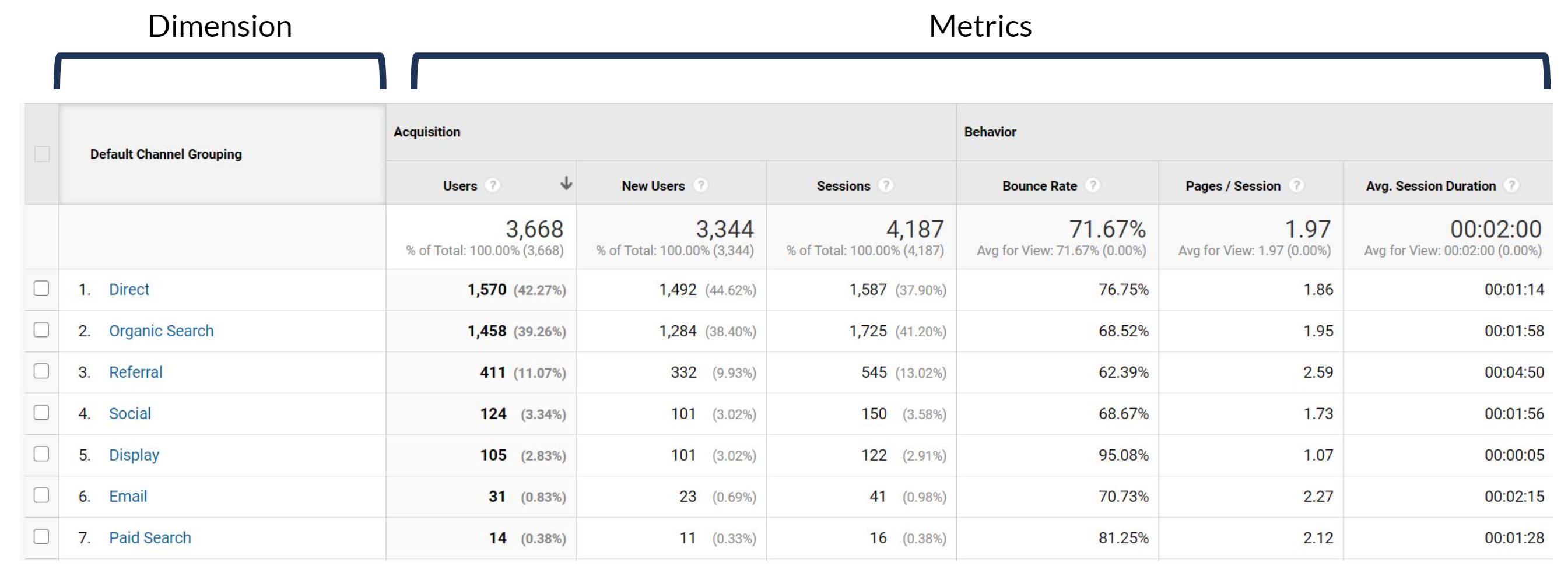
All data visualization tools work in a similar way by giving you the ability to create charts, graphs, and tables using metrics and dimensions. To understand how to visualize the data, you first need to understand the difference between a metric and dimension.
What is a Dimension
A dimension is something that you want to measure the performance of. For example, date is a dimension and is useful to measure performance over time, which can also be broken down in any number of ways. You can use the date dimension to look at daily performance, monthly performance, or even performance by year.
Other dimensions can include, but are not limited to, landing page, channel grouping, gender, keyword, and more. Dimensions are where you want to start answering your questions.
 But dimensions by themselves aren’t very useful. You need metrics to actually measure the performance of a dimension.
What is a Metric
A metric is a quantitative value used to measure something, such as engagement. It is how you measure the success or lack thereof of a dimension.
Metrics can include, but are not limited to, impressions, sessions, conversions, conversion rate, and more.
By combining metrics and dimensions, you can start to understand the performance of your digital marketing and answer the questions we listed above. For example, you can look at sessions by date, conversion rate by gender, impressions by keyword, or mix and match them all.
How to Visualize Digital Marketing Data
Data visualization can be easily accomplished by using industry-standard tools. One of the most popular and the one we use at IDX is Google Data Studio.
The benefits of Data Studio are that it is easy to get started, extremely customizable, and completely free. And if you’re familiar with Google Docs or Google Sheets, you will feel right at home.
As mentioned earlier, the best way to start visualizing data is by compiling a list of questions you want answered. If you’re having trouble thinking of questions, start thinking about what your stakeholders are asking you. Every business has different goals, so it’s a good idea to answer the questions tailored to your business.
After all, if you can point your stakeholders in the direction of a reporting dashboard that answers their questions for them, you will have more time to run deeper analysis and think strategically.
As a starting point to show you how to visualize some basic digital marketing data, let’s take the following questions and utilize Google Analytics and Search Console data.
Is website traffic trending up or down?
- Dimension: Time-based, such as Date or Month of Year
- Metric: Sessions
- Data Source: Google Analytics
Since this is something that we want to look at over time, our main dimension will be a time-based dimension, like date or month of year. And the metric will be sessions, since we’re trying to understand the performance of website traffic.
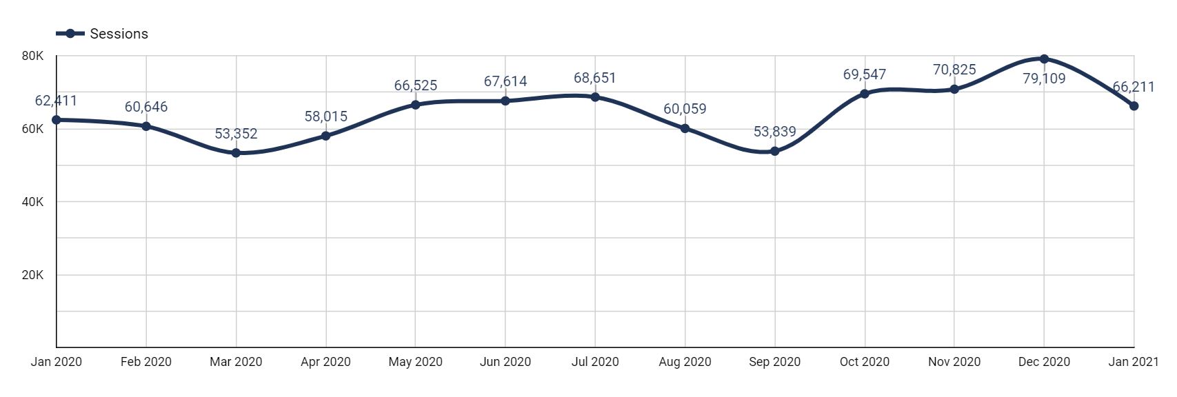
When answering questions that are time-based, make sure you’re using a date range that is reasonable and makes sense for your data.
If you’re making decisions in the short-term, look at the last month by day. If you’re reviewing long-term performance, look at the last year or two by month. If you want to run a year-over-year comparison, it’s best to use the month dimension for this year compared to the previous year.
Once you see if your website traffic is trending up or down, you can understand the performance of your current campaigns. You can also make decisions on whether to continue with your current strategies or pivot to something that is more effective in driving traffic.
What are the top landing pages by conversion rate?
- Dimension: Landing Page
- Metric: Conversion Rate
- Data Source: Google Analytics
Unlike the last question, this one isn’t isn’t time based, so we don’t need a graph. We can use a table to get a list of landing pages with corresponding metrics.
In addition to conversion rate, it would also be helpful to add other metrics like sessions and conversions, since they are all closely related and can easily fit into a table. The more you can remain organized and efficient in your reporting, the better.
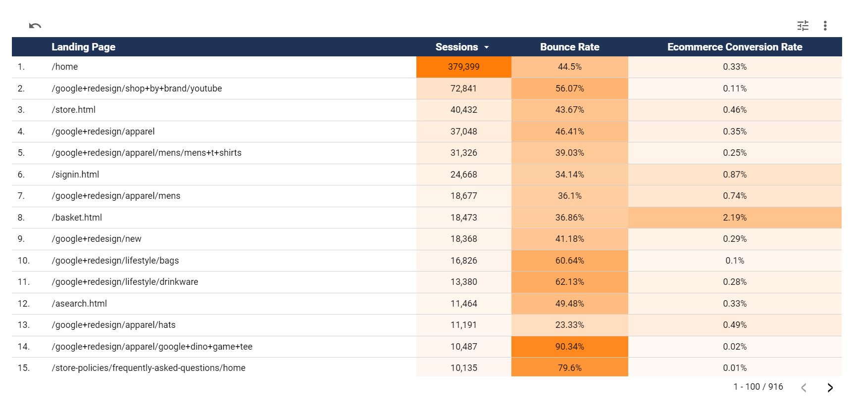 And if you add multiple metrics, add heat mapping to the columns to identify differences in the metrics.
By adding additional metrics and heat mapping to this table, you can identify pages that are great at driving traffic and ones that are great at converting users.
For pages that are driving a lot of traffic, identify ways to improve the conversion rate. For the pages that have a higher conversion rate, identify ways to increase traffic to those pages.
What directories on our site get the most traffic?
- Dimension: Page Path Level 1 (or the appropriate page path level based on your URL structure)
- Metric: Entrances
- Data Source: Google Analytics
Pie charts are useful to visualize a percentage breakdown of a dimension. In this instance, we want to understand what directories account for the most entrances to our site. And to avoid too much noise in the chart, I wouldn’t use more than 6 slices in the pie.
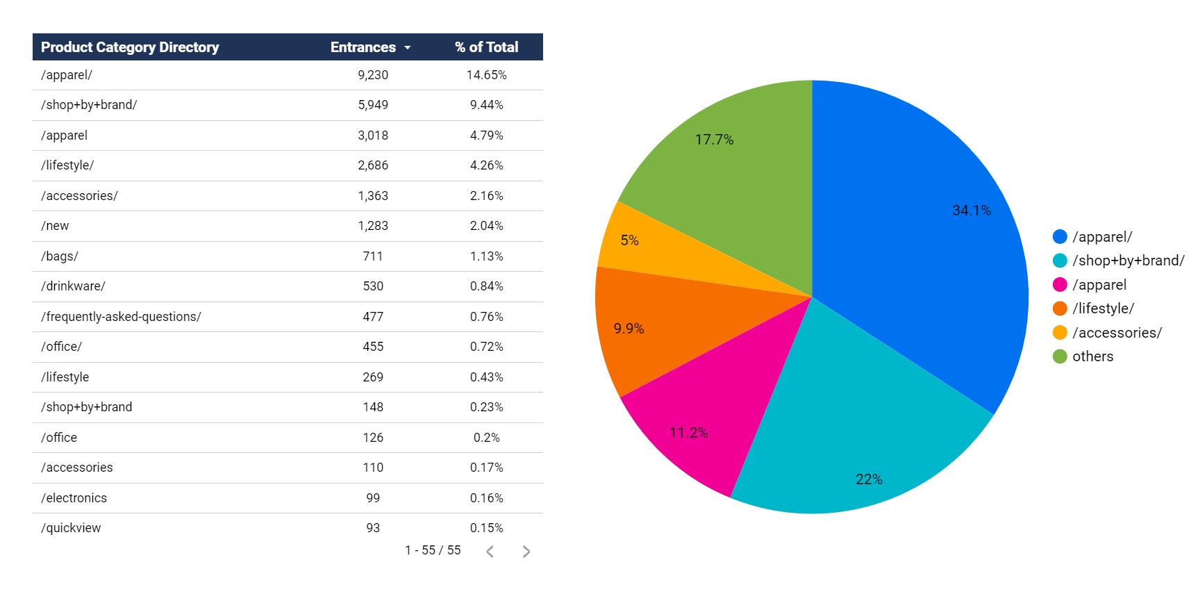 When utilizing graphs that are limited in the amount of data they can show, it is often helpful to add a companion visualization next to it, such as a table with the same dimension and metrics. That would be helpful in this instance to make all of the data easily exportable and provide more information about the directories that are not in the top 6.
The action item here would be to understand what directories are driving a majority of traffic to our site. If it is only 1 or 2 directories, can we expand our content creation and increase our audience reach?
Are users who utilize our interactive content more likely to convert?
- Dimension: Users who utilize interactive content vs. those who don’t
- Metric: Conversion Rate
- Data Source: Google Analytics
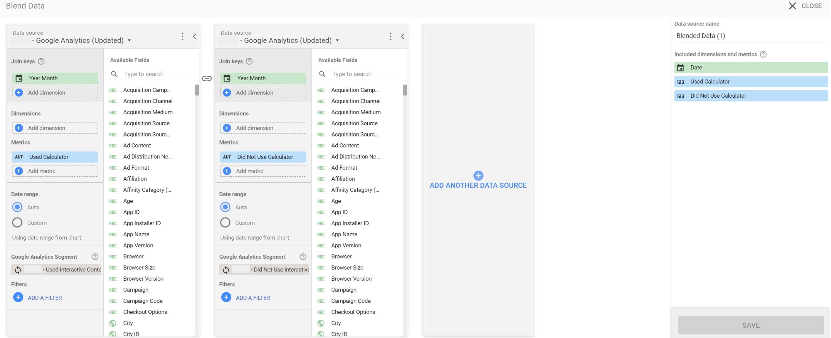
This one is slightly different from the others in that it requires a custom dimension, which you can make using blended data in Data Studio or calculated fields.
In this instance, you would create a blended data source by blending your Google Analytics data source with itself and adding a Google Analytics segment for “users who used the interactive content” vs. “users who did not use the interactive content.” That segment can be based on an event that triggers when someone users the interactive content.
The blended data source structure would look like this:
 The “Used Calculator” and “Did Not Use Calculator” metrics are actually the Goal Conversion Rate metric, but they have been renamed to make it clear which conversion rate is for which group of users.
And after graphing that data in a line chart, you would be presented with the following visualization to quickly and easily see that users who utilize the interactive content regularly convert more often than users who don’t.
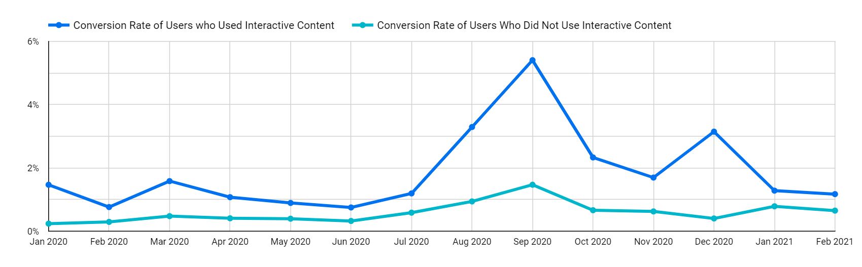 The takeaway here is to understand whether certain types of content lead to more conversions. In this case, the interactive content does regularly lead to higher conversion rates, so we should either create more interactive content or introduce this interactive content to more users on our site.
This was an important question to ask of our data to show that you shouldn’t be constrained with the out of the box dimensions and metrics provided by Google Analytics. Start with the questions you want to answer to better understand the performance of your digital marketing efforts.
Are we ranking for more keywords than we were last year?
- Dimension: Time-based, such as Date or Month of Year
- Metric: Number of Keywords
- Data Source: Search Console
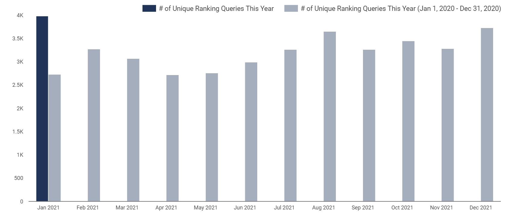
This is another unique question because there is no “Number of Keywords” metric provided in Search Console, but that doesn’t mean we can’t calculate the number of keywords in our data visualization platform as shown below.
 In Data Studio, all metrics have an aggregation type, such as sum, average, count, count distinct, etc. Most metrics have a sum type aggregation, which means you add (sum) up the values over the period. If you want to graph the number of sessions over time, you don’t want the average number of sessions for the period, you want the total (sum) sessions for that time period broken out by day, month, or year.
There are two tricks here that we are going to use. First, you can use dimensions as metrics. Second, dimensions can also have an aggregation type when used as a metric. Now, there are limitations on the type of aggregation. For example when considering Device Type as a dimension, you can’t add (sum) iPhone + Android, but you can count them. In that example, there are 2 devices.
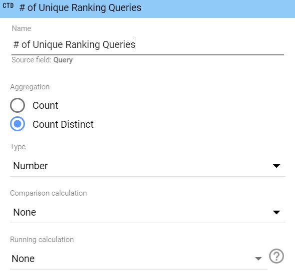
To measure the number of keywords ranking over time, you can count the number of keywords. So while the number of keywords ranking is not a metric provided by default within Search Console nor the API, you can use the query dimension as a metric and set the aggregation type to count distinct. We want to use count distinct in the event that a keyword shows up twice in the date range we selected.
And from there, all we have to do is use any time-based dimension to graph the number of keywords metric over the time period we select.
The takeaway here is to measure the performance of our SEO campaigns and our keyword footprint. As we work to improve our website’s authority in Google, we would expect to start ranking for more of our targeted keywords, which is visualized in the graph above.
What IDX Recommends
Here at IDX, we recommend taking full advantage of your data to improve your advertising campaigns and digital marketing performance. That data is the competitive edge your business needs to stand out from your competitors.
If you haven’t started visualizing your data, we recommend starting with Google Data Studio, which is our preferred tool. If you’re having trouble starting, ask questions of your data and work on compiling answers to those questions with graphs, charts, and tables.
If you have the data, you can visualize it. And if you can visualize it, you can start identifying the successes of your campaigns and opportunities for improvement.
Conclusion
All of the data in the world is useless unless it can be analyzed and used to identify your next steps. Your business almost certainly has vast amounts of data waiting to be analyzed and interpreted to improve your digital marketing performance.
Data visualization is and will continue to be an important part of the digital marketing world. The value it provides in turning complex data into actionable insights is second to none.
At IDX, data is an integral part of our digital strategies, analytics, and reporting because of the value it provides to both our internal team members and clients. Turning complex data into actionable insights is something we are immensely proud of and strive to accomplish for all of our clients.
If you’d like to learn more about how IDX can help improve your digital marketing, please contact us here.